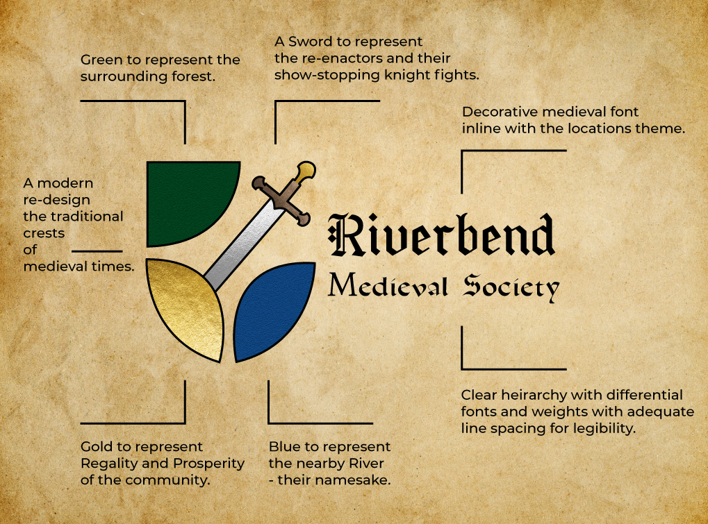
About the Brand

Riverbend Medieval Society is a re-enactment troupe working out of Victory Village at Riverbend - a small holding farm in Tiaro Queensland. It's an old English village setting with cottages, workshops and gardens.

Brand Mission

Our mission is to create an authentic and engaging experience that spans centuries of culture, from the valor of knights and the mystique of Vikings to the wisdom of witches. Through immersive re-enactments and traditional crafts, we aim to educate, entertain, and inspire a deep appreciation for the past.

Project Scope

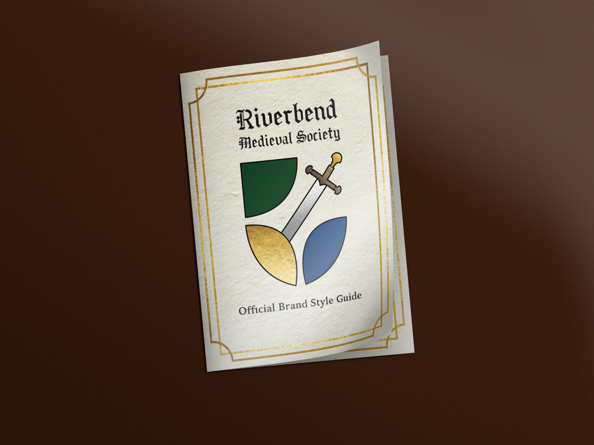
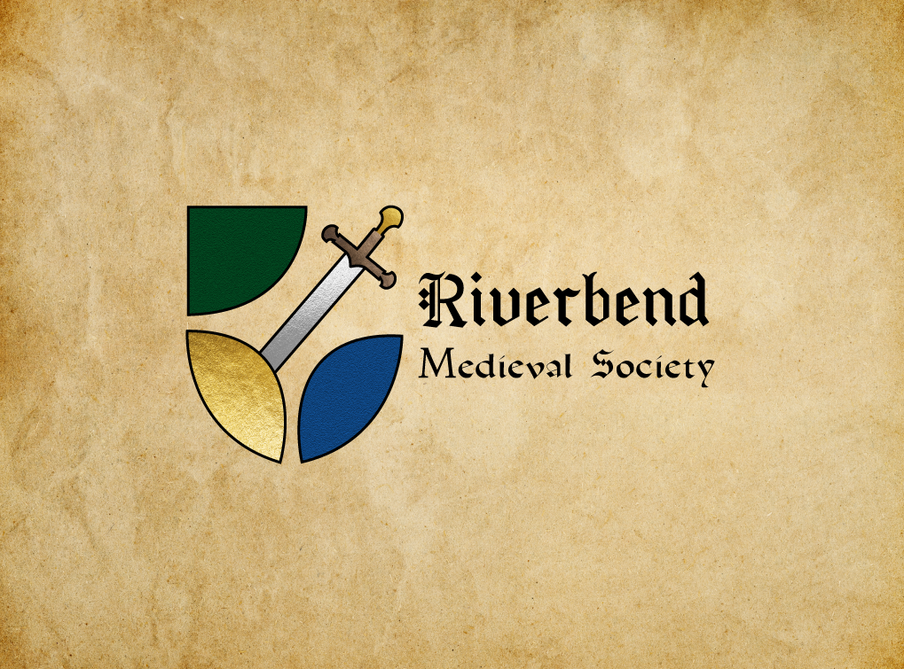
This Project began as an exercise in re-branding an existing location. This included a full brand analysis, brand strategy and visual identity. Once this was established I also created a guidebook to the village with all original designs and photography.

Here's The Strategy

- Audience Pain Points -

When you search Victory Village at Riverbend, it's a little unclear as to what they offer. Their Facebook
page description doesn't explain their involvement in reenactments, nor do they elaborate on exactly what they do as a village or what they’re purpose is. However, further down they label themselves as “Arts and Entertainment”.

While the location and the re-enactment society are two individual identities, they are extremely entwined; as the re-enactment was formed at Riverbend, takes place at Riverbend and the re-enactors all board on location in their village sectors. When searching online it can be very confusing as the location is known by many names such as Victory Village at Riverbend, Victory castle and Victory Village Farm. 

At it's heart Victory Village and Riverbend Medieval Society are rooted in the community. While both are very active on Facebook in terms of developments and events; information on getting started, learning about each group or what even goes on is hard to come  by, unless you attend an event in person.
- So What Did We Do? -

Wanna Know More? |

After
Before
Style-Guide-Cover
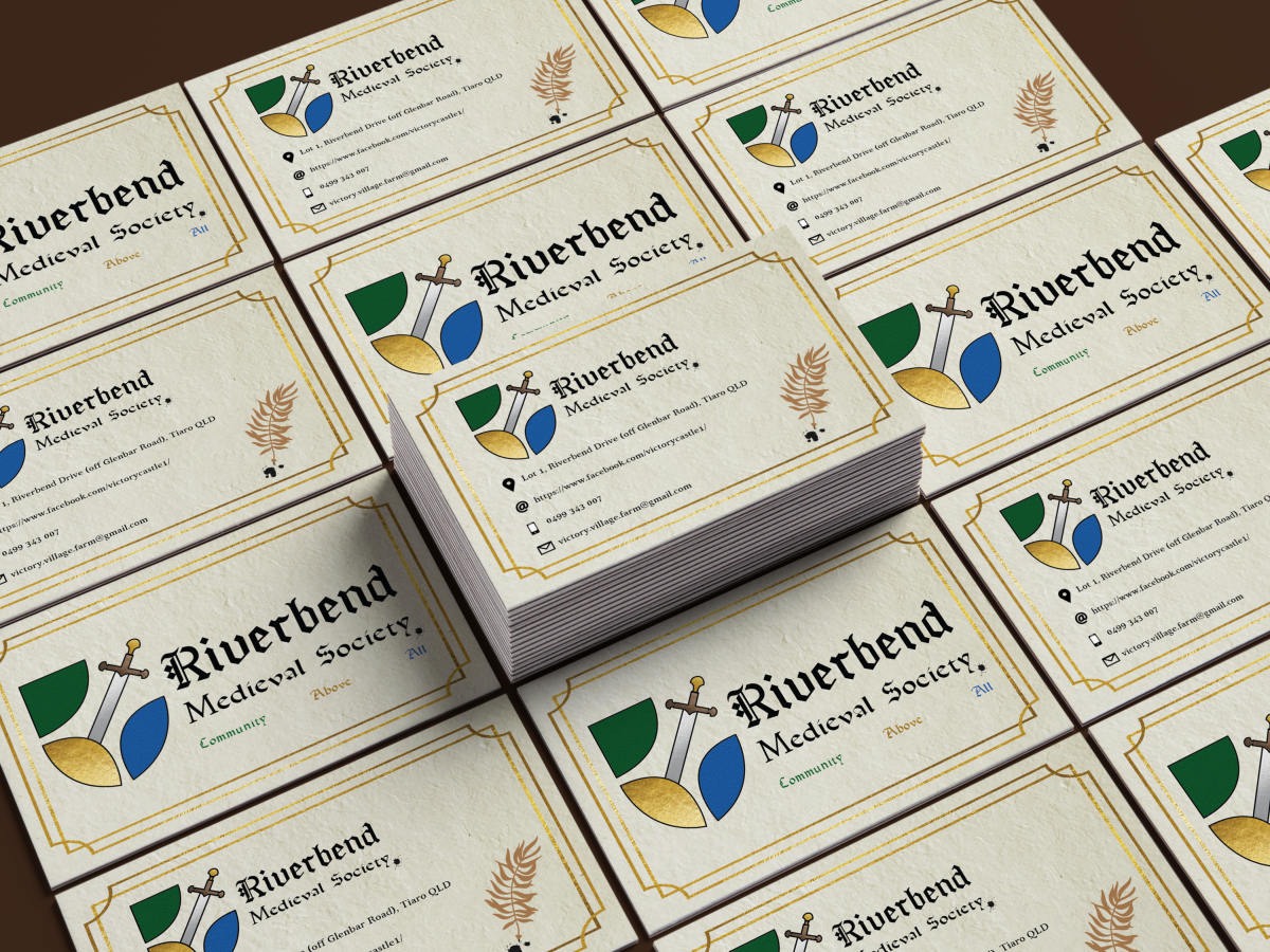
Perspective Business Cards MockUp resize
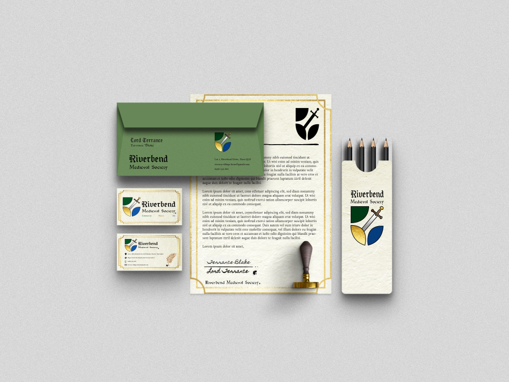
Business Stationery
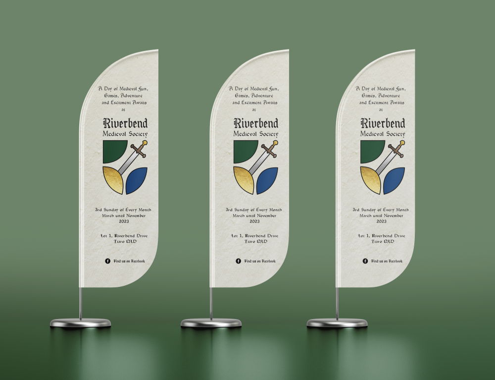
Flag_Mockup_2
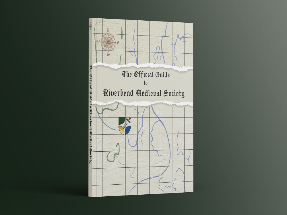
book_cover_mockup_02resize
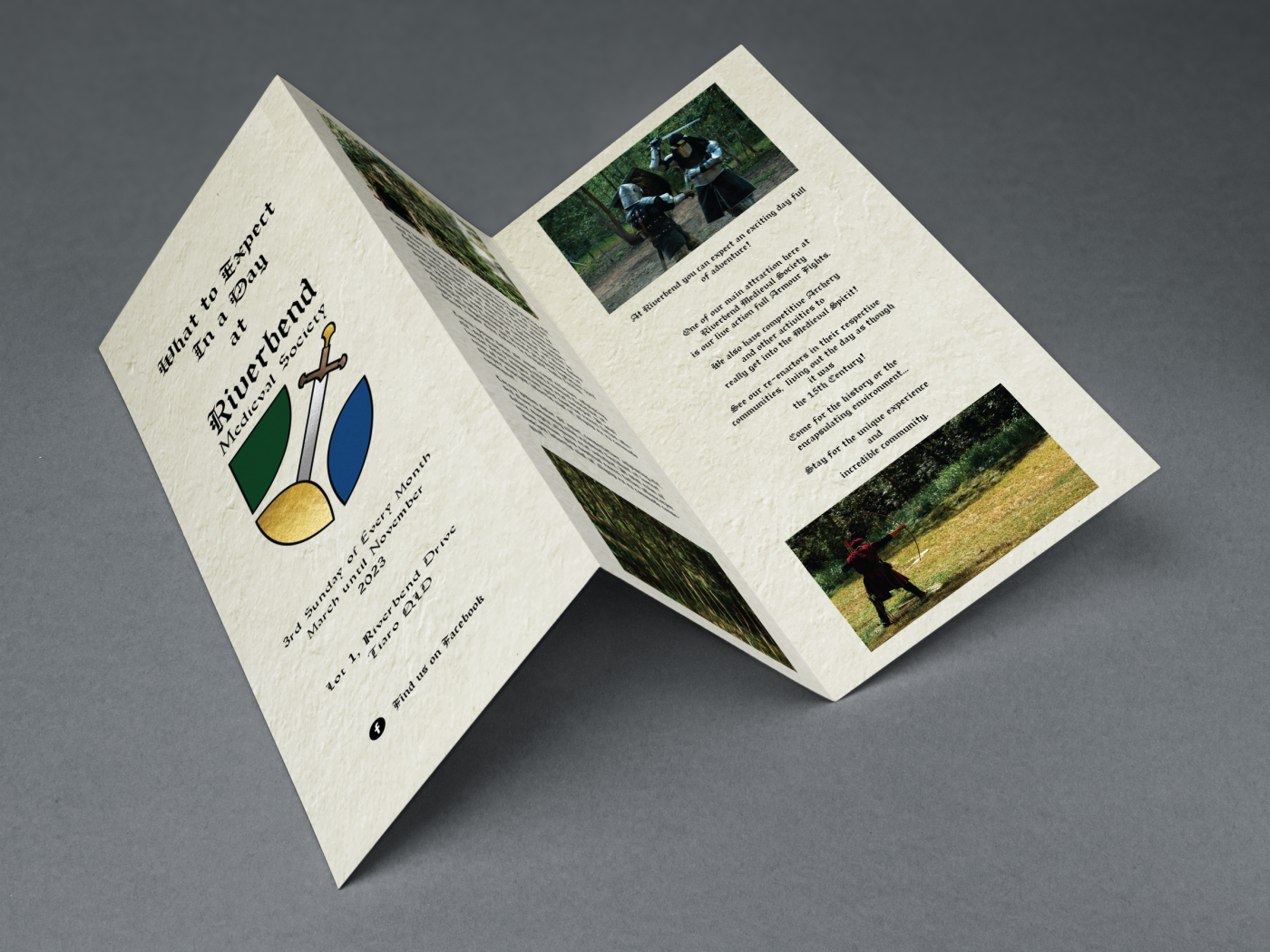
Tri Fold Brochure MockUp
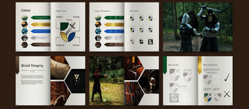
Style Guide Mockup Continued showing the colour breakdown, versions of the logo, more photography and the watermark for the brand.
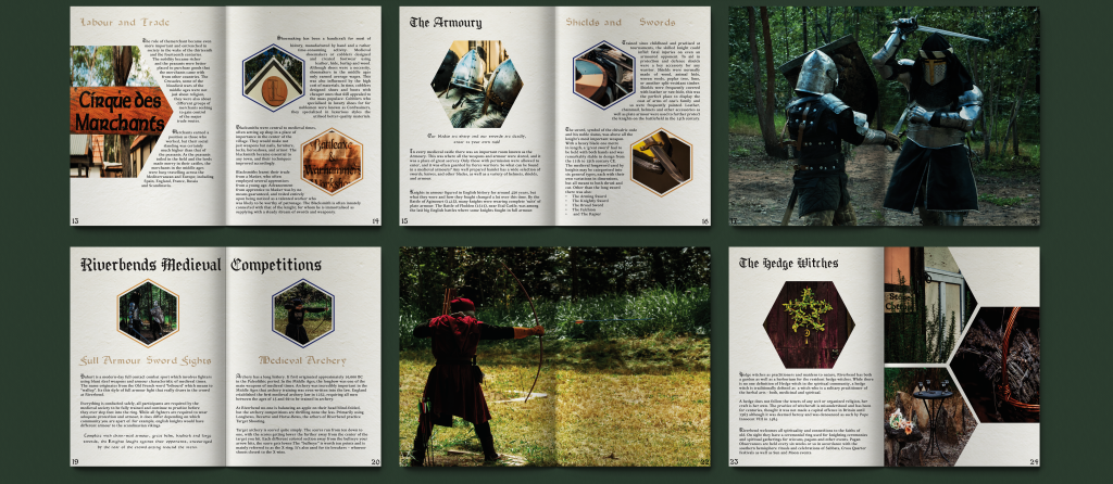
An open medieval-themed magazine with six pages. The pages feature text and images including knights in armor, archery, a circus, a detailed suit of armor, and various medieval weapons. Backgrounds include forest scenes and close-ups of items like herbs and weaponry.
A black, star-shaped geometric outline with four elongated points, forming a white diamond shape

Don't Take My Word For it, Check Out These Brand Believers!

A black, star-shaped geometric outline with four elongated points, forming a white diamond shape
Illustration of a hand holding a pen with a sparkling effect near the writing tip. The hand is stylized with bold lines and a minimalist design. The pen has a pink eraser on top, and the overall image conveys a sense of creativity and precision.

Be Bold, Be Brave, Be Authentic In Your Branding. |

* This project was completed as apart of my Diploma of Graphic Design. Victory Village was contacted and supported the use of their business in this project and are aware of the designs and the circumstances of these projects. They gave their expressed permission for any use of their branding, their images and are aware of their presence in this portfolio.*